Linkedin
Say Hi!
Thank you! Your submission has been received!
Oops! Something went wrong while submitting the form.


Hi, I’m Christina Agront, a graphic designer with a big passion for motion graphics and all the creative possibilities that of with the field. I love bringing visuals to life through movement, whether it’s animated logos, kinetic typography, or short motion pieces that tell a story. But beyond motion, I’m also into the full spectrum of design, branding, layout, illustration, and everything in between. For me, it's all about creating work that feels thoughtful, intentional, and visually striking.As someone just starting out in the industry, I’m constantly learning, experimenting, and pushing myself to grow as both an artist and a problem-solver. I believe good design isn’t just about how things look, it’s about how they work, move, and connect with people.
Thanks for stopping by—let’s create something awesome

Otl Aicher is a renowned German designer. I designed a magazine spread highlighting his visual identity work for the 1972 Munich Olympics. I integrated his iconic pictograms at low opacity to create visual texture while allowing the photography to remain the focal point. The typeface Minion Pro was chosen for its legibility and classic form, and the color palette is directly Aicher’s original Olympic design system directly inspires the color palette by Aicher’s original Olympic design system.


I created a website inspired by the Exo typeface, designed by Natanael Gama. The site features an interactive type tester, allowing users to input custom text and experience the font in real time. A side-by-side glyph viewer displays individual characters, with a larger preview appearing on the right when hovering over the corresponding glyph on the left. An alphabet scroll showcases the full character set, with line weight and highlight effects triggered on hover. Additionally, an “Exo box” allows users to adjust the font’s weight and width using interactive sliders. The website concludes with a section dedicated to the type designer, providing background on Natanael Gama and his work.


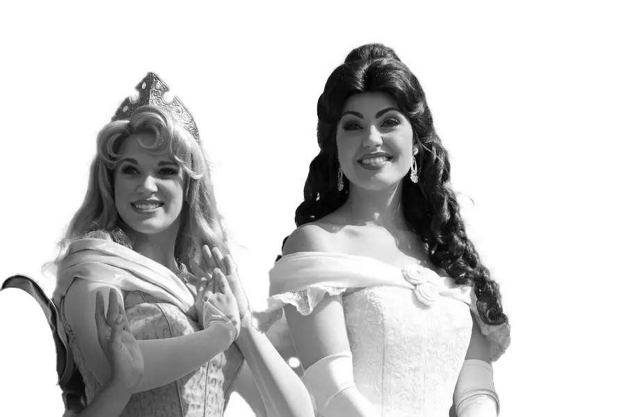
I designed an infographic poster centered around the Disney Princesses. The poster visualizes shared personality and physical traits among the princesses, along with a selection of popular fan theories about their stories. I used a playful pastel color palette to reflect the familiar, image they hold in popular culture. Each princess is represented as a silhouette, with only their unique traits highlighted, allowing viewers to identify overlapping characteristics easily. I included a QR code linking to fan theories to add an interactive element.


A series of redesigned classic book covers. I used duotoneimagery that interacts with the titles, such as the finger forming the crossbarof the capital 'A.' I applied Bebas as the display typeface for all authornames to establish typographic consistency and a visual system across theseries. Each composition is set against a dark background to enhance contrastand maximize visual impact.


The subject’s head slightly obscures the lower part of the 'S, but I intentionally left a visible sliver to allow for legibility through visual inference. The magazine targets a younger demographic, so for the feature spread, I selected a young contemporary artist and included an article showcasing his work. The table pastel blue text to create contrast against the darker elements in the photo. The back cover features a full-page bleed an advertisement for sneakers.


A packaging system designed for a boutique hotel. The logo was inspired by the ibex, a local animal native to France. I integrated its horns into the top of the "V" in the logo. The packaging features angular, descending lines to convey a sense of movement, paired with a vibrant color palette that sets it apart from competitors. One side of the packaging reveals the logo on its own, while the other side displays a slogan that complements the contents within.


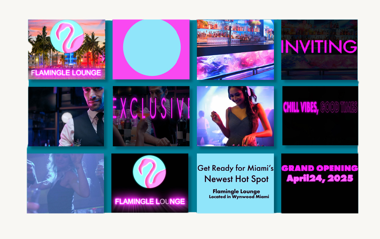
A motion graphic for Flamingle Lounge, inspired by Miami nightlife and designed to appeal to a younger audience. The logo draws from Florida’s vibrant identity, featuring the silhouette of a flamingo, pastel blue for the sky, and gold to represent the sun. I chose a circular shape to complement the organic curves of the flamingo. Futura was used for the typography, which transitions smoothly between scenes. Adobe Stock footage was incorporated to enhance the overall composition and elevate the visual energy.

A motion graphic inspired by the 1988 film Who Framed Roger Rabbit. For this animation, I took on the challenge of illustrating the main character frame-by-frame using a PNG sequence in After Effects. A selected MP4 clip from the original film plays in the background. I used bold, solid colors for the character animations with fade-out transitions to create smooth scene changes. The color palette reflects the film’s vibrant aesthetic, using bright, saturated tones to capture its playful energy.


A customer service app designed to make life easier for both employees and consumers. With shared profiles, employees can see exactly what the consumer is looking for and their preferences.I created a toggle that leads to the login page and incorporated a scrolling list of locations, so consumers can recognize a location even if they don’t remember the zip code.The app also suggests apparel the consumer might like, which they can add to their wishlist or proceed to checkout.A chat bubble allows consumers to speak directly with an employee.


This book was inspired by their relationship and the work they created together. The color scheme of red, yellow, and blue was inspired by the paneling on the side of their house, Case Study 8. The spreads contain full-page bleeds and other materials, such as vellum paper and acetate, for the timeline showing their accomplishments throughout the years.


